
Updated November 2026
Brand Guidelines
These guidelines define the visual and verbal elements of the Lightmatter brand and explain how to use them. They are updated as the brand grows. Find the PDF and brand assets on the downloads page, or reach out below with questions.


Logos
Lightmatter’s wordmark and monogram closely aligns with the behavior of photonic computing through a typographic interpretation on inference. The aesthetic of the custom type in the letters “L” and “M” resemble a unique yet familiar form when compared to their native letterform. It intrigues our minds to make the connection, straddling both the familiar with the unfamiliar. Further, it helps us recognize how the unknown can be realized.
Logomark
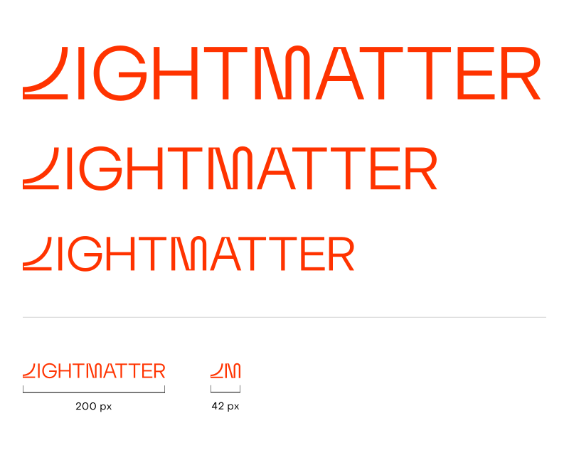
The monogram should be used as the main logo. The 1:2 ratio encourages flexibility across various sizes and areas. It is intended for use on all applications on both print and digital mediums.
Never alter the scale and spacing around or between the monogram, its coloration or form. Do not redraw or alter its original measurements or thickness. On white backgrounds, use the red logo. On red or black backgrounds, use the white logo.



Wordmark
The wordmark is long, so use it where the full brand name is needed and there’s room for it, such as large signage and cover slides.
Never alter the scale and spacing around or between the wordmark, its coloration or form. Do not redraw or alter its original measurements or thickness.



Scale
Both the wordmark and monogram should always be scaled proportionally, maintaining their original proportions.
To avoid any degradation of the marks, the wordmark should never be scaled below 200 px or 2.78″ in width. The monogram should never be scaled below 42 px or 0.58″ in width, as demonstrated below.
Product Wordmarks
The wordmark should be used only in necessary instances where the full brand name is needed, given its length and scale. It is intended for use on most applications on digital mediums.
Never alter the scale and spacing around or between the wordmark, its coloration or form. Do not redraw or alter its original measurements or thickness.




































Social Avatar
The monogram should be used for icons or framed areas. Whether the format is a square or a circle, center the monogram and make optical adjustments as needed.
Follow the adjustment construct to ensure the monogram is optically centered.
Color
Using color for the identity is not subjective. It’s an important element within the Lightmatter identity. Our colors are a defining aspect of our brand and help us stand out in our field. In addition to the neutral colors, we have a range of distinctive secondary and tertiary colors that add vibrancy and dynamism to support our primary palette. To be effective, one needs to follow the established usages.
Type
Two typefaces carry the brand. Inference Sans is our ownable display face for headlines and big brand moments; Object Sans does everything else: subheads, body copy, captions, and UI.
Icons
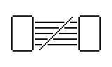
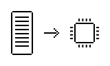
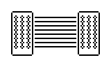
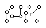
In line with our personality, all Lightmatter iconography uses an 8-bit style. Keep details to a minimum. Simplicity makes each icon’s meaning easier to understand. Use icons thoughtfully and intentionally. They are mainly for internal programs and product UI. Use them to support navigation or explain an idea. Do not use them as casual decoration or as a default replacement for other visuals. Do not use them in external marketing unless approved.








Imagery
These four directions are starting points for campaign photography. They are meant to guide image selection, not define an exhaustive or expensive library. Use discretion when choosing imagery. Select high-quality images that feel intentional, ownable, and aligned with the Lightmatter brand. For high-reach campaigns or prominent placements, seek brand approval before use. Each direction should express movement from here to there and the dramatic journey photonics makes possible.

Direction 1
Pivotal Movement
Technology is a pivotal component of human advancement. This direction highlights space through magnificent man-made technology, showcasing our constant progress forward.
Direction 2
Expansive Portal
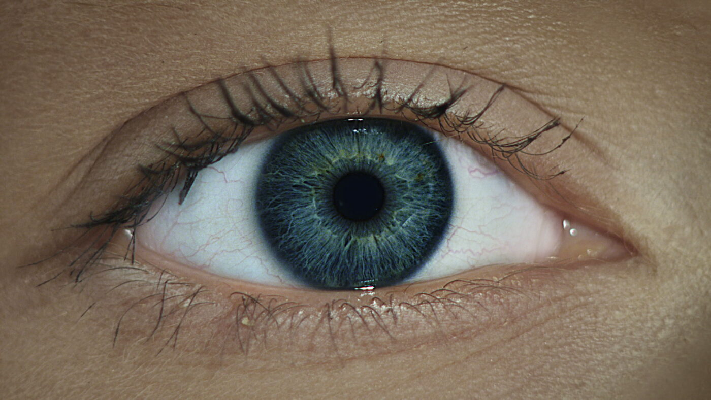
Images should visualize expansive movement through a portal, bringing us from here to there. This figurative concept conveys wonder, movement, and a physical embodiment of the dramatic journey made possible by photons.

Direction 3
Light Travel / Point A to B
Images should highlight a path from here to there. They show movement through light and make photons feel visible to the naked eye. The goal is a spectacular, lasting impression of technology in the world at large.
Direction 4
A Giant Leap
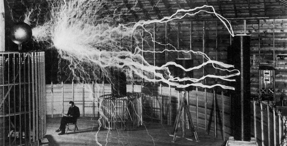
Images should represent revolutionary moments and figures in history, such as Neil Armstrong, Nikola Tesla, and Claude Shannon. This direction is a literal take on A Giant Leap. It highlights moments in science and technology that changed how we live, think, and understand the world. Close crops should make the viewer feel near the moment. They should build curiosity and excitement, tying back to Pivotal Movement.
Voice
Brand voice is how our brand comes to life in the world. It is our personality. It shows up in the language and design we use to tell people who we are and what we are about in a consistent, compelling way.
Like any voice, brand voice has range. Consistency is not the same as sameness. Our brand can, and should, stretch to fit different scenarios, contexts, and audiences.
Daring
Bold
Confident
Aspirational
As befits a brand pushing a paradigm shift in technology, our personality reflects vision and dedication. We harness this daring across the brand, from visual expression to verbal expression.
Playful
Clever
Witty
Fun
Levity helps us stand out in a category focused on changing the world. Our brand can be clever, witty, and fun when the situation allows. We are committed to enjoying the journey.
Optimistic
Enthusiastic
Earnest
Warm
Our work includes setbacks and challenges. Optimism helps us push through them. It keeps the vision elevated beyond application and focused on human progress.
Smart
Bright
Intellectual
Thoughtful
We are experts in the field, and our work should reflect it. But expertise is not enough. We share knowledge in a way that feels enriching and as fascinating as the breakthroughs themselves.
We’re Lightmatter, the photonic (super)computer company. We’ve created an integrated photonics chip and ultra-high performance interconnect that is faster, more efficient, and cooler than anything else on earth (or anything ever experienced before) to power the next giant leaps in human progress.
Trademarks
Trademark symbols provide legal notice, but they aren’t required on every instance. Mark the first prominent use in each piece, and let the attribution line handle the rest.
The ® symbol identifies a registered trademark. The ™ symbol identifies an unregistered trademark. Used consistently, they help protect Lightmatter’s brands and technologies.
Below is a non-exhaustive list of Lightmatter trademarks.
Rule 01
Mark the first instance
Mark the first or most prominent use of a trademark, then drop the symbol on every use after that in the same piece.
Rule 02
Add the attribution line
Include the approved attribution line once per piece, in the footer, closing slide, product docs, or terms of use. It names every Lightmatter trademark in one place.
Logos
Lightmatter logo
Keep the logomark and wordmark clean everywhere, in the site header, footers, product dashboards, and slide masters.
Logos generally do not require a ® or ™ symbol. The attribution line provides trademark notice.
Slides
Presentations
Mark each trademark’s first use, usually on the title or first content slide. Don’t repeat it after.
Mark a standalone slide too, if it might be screenshotted or shared on its own elsewhere.
Put the attribution line on a closing legal slide.
Website
Web pages
Mark the first use in body copy, then drop the symbol on the rest of the page.
Nav, headings, and titles can stay clean, including a hero title like “Passage.”
Keep the attribution line in the global footer.
Product
Product engravings
The LM logo and product name don’t need a ® or ™ symbol on the product engraving. It is ok to leave the trademark off the product to keep things clean.
The attribution line ships with the product instead, on the packaging, datasheet, or an included card, and provides the notice.
In the United States
Use the ® or ™ symbol on the first prominent use, for example, “Passage® interconnect.”
Outside the United States
Trademark symbols are often omitted. Use the attribution line instead.